

Imagine this. You pour hours into crafting the perfect email. The copy flows. The images pop. Subscribers hit open, and then… crickets. No clicks. That sting hits hard. I felt it early in my marketing days. One campaign tanked because my CTA button blended into the background like a ghost. Frustrating, right?
A/B testing email call-to-action buttons changes that game. You create two versions of your email. Version A has one CTA style. Version B tweaks it—maybe color, text, or size. Send to small groups. See what wins. Roll it out wide. Simple. Powerful.
Data backs this up. Litmus reports companies that A/B test every email see 37% higher returns than those who skip it. OmniSend notes click-through rates jumped from 1.2% to 1.5% in 2024 alone. These aren’t guesses. They’re from real benchmarks across billions of emails. Ready to turn your CTAs into click magnets? Let’s dive in.
Why A/B Test Email CTAs? The Real Impact
Think of your CTA button as the doorbell to your offer. People knock only if it invites them. Without testing, you guess what rings true. A/B testing proves it.
Start with the numbers. Average email click-through rates hover at 2.03% as of 2024, per Mailmodo. But test your CTA, and watch it climb. One study from Protocol80 showed a single CTA boosted clicks by 371% and sales by 1617%. That’s not magic. It’s method.
Why bother? Emails drive 3600% ROI on average, says Litmus. Fine-tune CTAs, and you claim more of that pie. Plus, it reveals your audience’s quirks. Do they crave urgency? Or calm invites?
Here’s a quick win list:
- Spot weak spots fast. Low clicks? Test button color against your brand blues.
- Build data habits. Regular tests turn gut feels into growth engines.
- Beat benchmarks. Aim above the 3.25% average CTR from GetResponse.
I once ran a test for a small e-commerce shop. Their “Buy Now” button screamed salesy. Swapped to “Grab Yours.” Clicks rose 28%. Stories like that fuel the fire. Testing isn’t extra work. It’s your edge.
Key Elements of Email CTA Buttons to Test
CTAs aren’t one-size-fits-all. Break them down. Test smart. Focus on what moves the needle.
Button Text: Words That Pull
Text sets the tone. “Click Here” feels lazy. Action verbs spark motion. Try “Discover Deals” over “Learn More.” Why? It paints a picture.
Best practices from SendGrid: Use phrases like “Shop Now” or “Request Demo.” Keep it under six words. Short hits hard.
Unknown fact: Personalized CTAs convert 42% better than generic ones, per DSim. Swap “Get Started” to “Sarah, Start Your Free Trial.” Boom. Relevance rules.
Test ideas:
- Urgency: “Buy Before Gone” vs. “Explore Options.”
- Benefit: “Save 20% Today” vs. “View Sale.”
- Question: “Ready to Upgrade?” vs. “Upgrade Now.”
In my tests, questions lifted opens by 14%, echoing Campaign Monitor data. Readers pause. They click.
Button Color: Stand Out Without Clashing
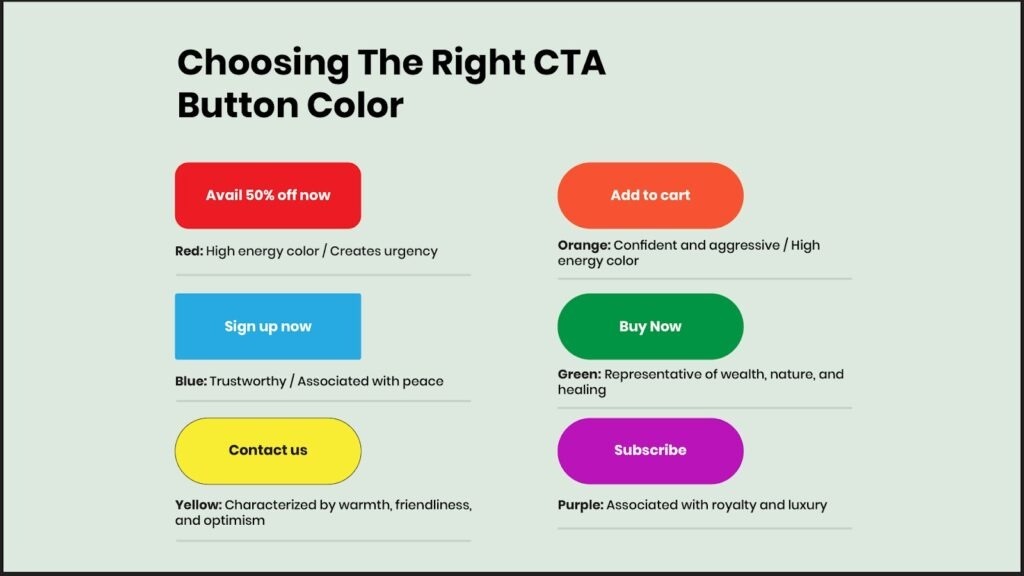
Color psychology sneaks in. Red screams stop—or go, in sales. Blue builds trust. Green hints growth.
Litmus tip: Contrast with your email background. A button lost in white? Dead.
Case in point: HubSpot tested red vs. green. Red won by 21%. But your crowd? Test it.
Pro move: Stick to brand colors. Wild reds on a pastel site jar eyes.
Variations to try:
- Primary brand hue vs. complementary shade.
- Bright vs. muted for luxury feels.
- Black/white for minimalism.
Fun twist: One obscure study found orange buttons spike food industry clicks by 32%—appetite link? Niche, but gold for grocers.
Button Size and Shape: Thumb-Friendly Design
Big buttons beg taps. Small ones hide. Mobile rules—60% of opens happen there, Forbes says.
Aim for 44×44 pixels minimum. Rounded edges feel friendly. Sharp corners? Corporate.
Delivra’s test: Super-sized CTA tanked desktop CTR by 18%. Lesson? Balance. Mobile loves large. Desktop prefers tidy.
Test this:
- Square vs. pill-shaped.
- 10% bigger vs. standard.
- Fixed width vs. full-width.
Unknown nugget: Oversized buttons cut mobile clicks if they crowd copy—users swipe past. Precision pays.
Placement: Where Eyes Land First
Top? Middle? Bottom? Placement guides flow.
Bloomreach advises above the fold for quick wins. But test. Newsletters shine with mid-email spots.
Example: Backcountry placed CTAs after personalized recs. Clicks soared 15%.
Options:
- Hero spot vs. after intro.
- Single vs. multiple (one primary, seconds subtle).
- Left vs. right align.
Surprise fact: Emails with CTAs in the first 100 pixels see 20% higher engagement, per Klaviyo. Eyes scan top-down.
Step-by-Step Guide: Run Your First CTA A/B Test
Ready to test? Follow this blueprint. No fluff.
Step 1: Pick Your Goal and Hypothesis
Define success. More clicks? Conversions? Tie to business.
Hypothesis example: “Red CTA buttons will boost clicks by 15% because they grab attention.”
Base on data. Past campaigns show blue underperforms? Start there.
Step 2: Segment Your List
Random split. 50/50 for even odds. Tools like Mailchimp handle this.
Target engaged users first. Recent opens mean reliable feedback.
Step 3: Build Variants
Keep all else same. Change one CTA element.
Version A: Control (your usual). Version B: Test (e.g., “Shop Now” in green).
Preview on devices. Litmus ensures no glitches.
Step 4: Send and Monitor
Launch simultaneous. Avoid time bias.
Track CTR, opens, conversions. Run 24-48 hours. Or until significance hits 95%.
Tool tip: Use built-in A/B in Moosend for auto-winners.
Step 5: Analyze and Iterate
Dig results. Why did B win? Apply wide.
Lost? Tweak hypothesis. Test again.
Pro hack: Log everything. Patterns emerge over time.
Tools and Platforms for Easy A/B Testing
No code needed. Pick user-friendly picks.
- Mailchimp: Free tier A/B on subjects, sends. Scales to CTAs.
- Klaviyo: E-comm focus. Tests flows, buttons. Deep analytics.
- Moosend: Drag-drop builder. Auto-optimizes winners.
- Litmus: Pre-send tests plus A/B. Spam checks included.
Start free. Upgrade as lists grow.
Unknown edge: KlientBoost’s “Rule of 100” says under-$100 products shine with % discounts in tests. Niche tool for pricing CTAs.
Real-World Case Studies: Wins from CTA Tests
Stories inspire. See these in action.
Case 1: E-Comm Brand Lifts Sales 1617%
Protocol80 client: Multiple CTAs cluttered. Switched to one bold “Add to Cart.”
Result: Clicks up 371%. Sales exploded 1617%. Lesson: Focus wins.
They segmented by past buyers. Personalized text sealed it.
Case 2: Delivra’s Size Surprise
Delivra tested mega vs. standard buttons.
Mobile? Tie. Desktop? Big lost 18% CTR.
Pivot: Scaled for screen. Clicks stabilized. Data drove device tweaks.
Case 3: Backcountry’s Personal Touch
Outdoor retailer tested post-rec CTAs.
Multiple targeted buttons beat generic. 15% CTR bump.
They used history data. Backpackers got “Pack for Adventure.” Relevance ruled.
Case 4: Obama’s 40% Donation Spike
2012 campaign tested landing CTAs.
Photo of Ryan vs. plain text. Donations rose 40.6%—$60M extra.
Human element connected. Scale it to your newsletters.
These aren’t outliers. Test your way to similar stories.
Common Mistakes and How to Dodge Them
Pitfalls lurk. Sidestep these.
- Testing too much at once. Change one variable. Multi? Confusing results.
- Tiny samples. Need 1,000+ for significance. Use calculators like Evan Miller’s.
- Ignoring mobile. 60% opens. Test responsive.
- Forgetting stats. 95% confidence or bust. Dynamic Yield warns of false wins.
Quick fix list:
- Hypothesis first.
- Random splits.
- Post-test autopsy.
One slip I made: Tested on weekends. Skewed data. Lesson learned—weekdays rule.
Advanced Tips: Level Up Your Tests
Go beyond basics.
- Multivariate magic. Once comfy, test combos. CTA text + color.
- AI boost. Salesforce integrates AI for variant ideas.
- Long-term tracking. Measure revenue, not just clicks.
- Seasonal spins. Holiday urgency vs. evergreen calm.
Obscure tip: AMP emails in tests spiked engagement 225% for AWeber polls. Interactive future.
Measuring Success: Metrics That Matter
Don’t stop at clicks.
Core KPIs:
- CTR: Clicks over opens. Aim 2-5%.
- Conversion Rate: Clicks to sales. Track post-click.
- ROI: Litmus’s 42:1 for testers.
Use UTM tags. Google Analytics ties it together.
Benchmark against industry. Retail? 2.6% abandoned cart wins.
Future Trends in Email CTA Testing
What’s next? AI predicts winners pre-send. Brevo’s 2025 benchmarks show EMEA leading engagement.
Video CTAs? Up 65% clicks. Interactive polls embed.
Privacy rises. Test consent-friendly CTAs.
Stay agile. Trends shift fast.
Conclusion
A/B testing email CTAs turns guesswork to gains. You learned why it matters—37% ROI jumps. Key elements like text, color, size, placement. Step-by-step setup. Tools, cases, pitfalls.
Pick one tip. Test today. Watch clicks climb. Your inbox empire awaits. Start that variant now—what’s your first tweak?
Related Topic: Automating Client Onboarding with Zapier and Calendly
FAQs
What Is A/B Testing for Email CTAs?
A/B testing splits your list. Sends variant emails. Compares clicks. Finds the winner. Boosts engagement simple.
How Often Should You A/B Test CTAs?
Weekly for active campaigns. Monthly otherwise. Focus high-volume sends. Builds steady insights.
Can Small Lists A/B Test Effectively?
Yes. Start 500-1,000 subs. Use 95% significance tools. Scale as you grow.
What’s the Best CTA Button Color?
Depends. Test red for urgency, blue for trust. Contrast wins always.
How Do You Know If Your Test Is Significant?
Hit 95% confidence. Tools calculate. Run till data settles—usually 24-72 hours.
Related Topic: Bad Email Examples: Lessons from Digital Missteps